Case Study:
GymBuddy
Current Design
Analysis
Competitor
Analysis
Brand
Identity
User
Research
Ideation
& Prototyping
The Process
Original Design, Problem Statement, Goal
Competitor Analysis, Brand Identity, & User Research
Ideation & Prototypes

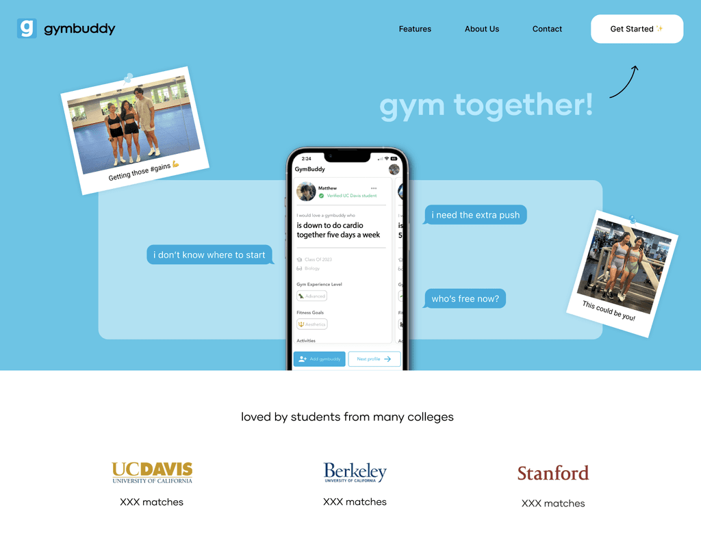
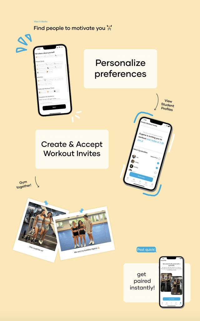
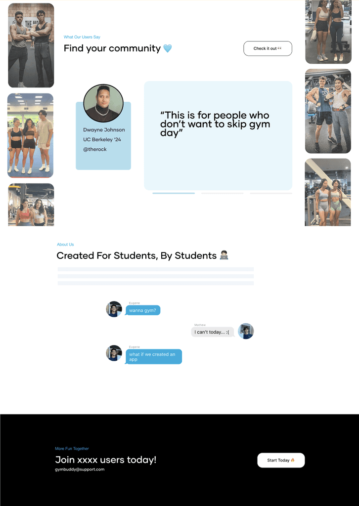
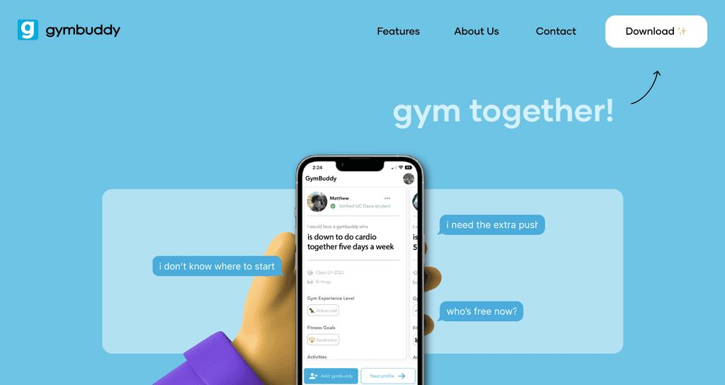
Gymbuddy is an application similar to a dating app but instead matches the user to a gym partner from their respective college. The purpose is to make users feel welcomed and prevent them from feeling intimidated or lonely from going to the gym alone. A gym buddy may motivate the user and hold them accountable.
Brand identity = friendly, welcoming, community, straightforward, personal, fun, and lowering fear for gym.
Target audience = young / Gen Z / college students.
Competitor Analysis
Apple, Hinge, Tangerine, Asana, Stripe
Use Hinge website as inspiration minimal, interactive, strong product narrative
Ideation
Include interactive and fun visual elements (e.g. emojis as part of the brand style)
Allow for easy navigation
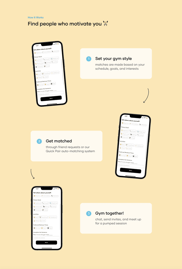
Visually separate sections
Landing frame should emphasize CTA buttons
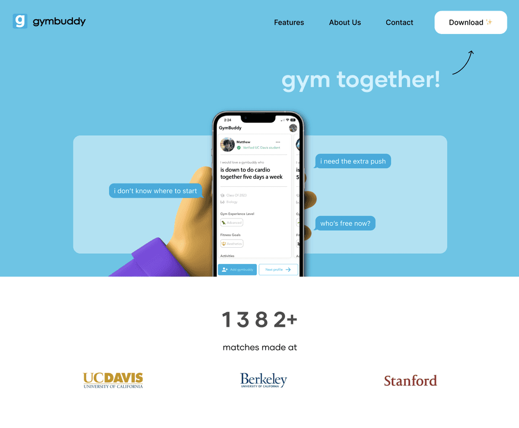
Add product value or statistics (e.g. # downloads, users, xx matches made etc.)
Include pictures of users using the app and gymming together, emphasizing community
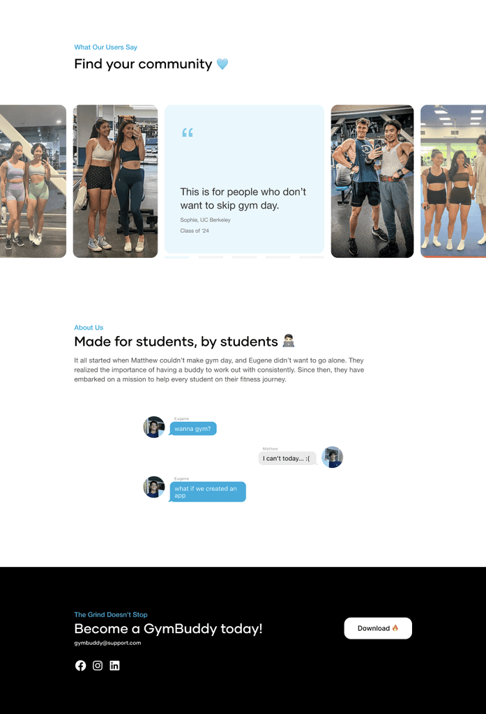
Include user testimonial
Add an "About the Founders" section so the app is personable
Add a contact us footer
Problem Statements
With the goal of making users feel welcomed and excited to go to the gym, the current UI is neither friendly nor fun.
Brand identity is not strong
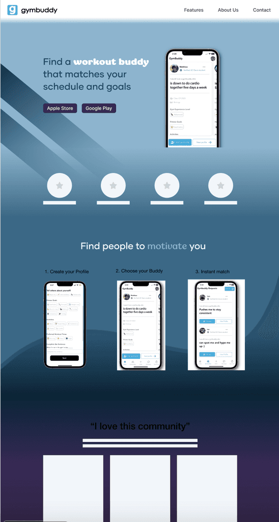
Lack of personality and color
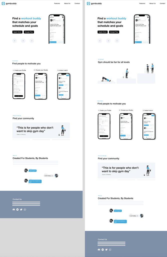
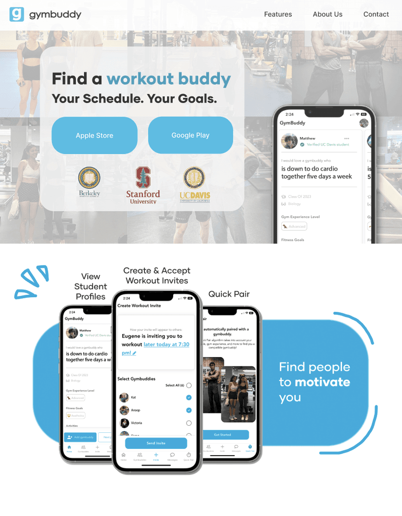
Displaying the application's features in three horizontal phones is not visually dynamic
Landing page is lackluster
Goals
Make the layout easy to navigate and avoid scrolling fatigue
Embed product narrative to showcase strong brand identity
Add interactive / fun visual elements to engage viewers
Brand Identity
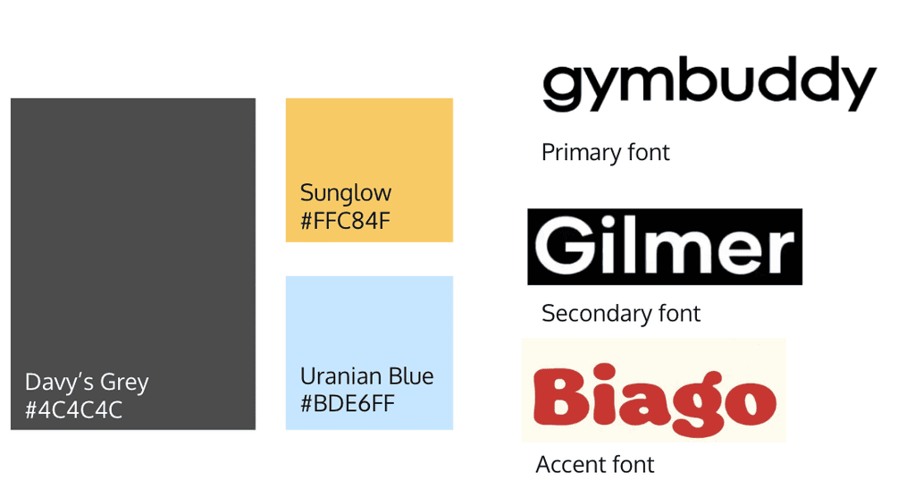
Primary, in variation of
Orange-yellow (community, friendliness, energy)
Gray (gym sweats, workout; neat, straightforwardness, simple)
Blue (maybe baby, trustworthy, gym vibes)

User Research
Color Palette
Many of the users felt the color palette didn’t remind them of the gym (reminded of the beach)
Overall, people liked the color combination (blue vs. orange/yellow) — pleasing to the eyes
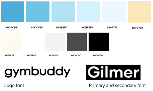
Typography
Accent font (Biago) reminded a user of food
A user preferred a stronger font like Gilmer
Three fonts made the design hard to read
Initial Style Guide
Final Style Guide
Low-Fi Prototype
Mid-Fi Prototypes
High-Fi Prototype
High-Fi Prototype
Final High-Fi Prototype
Testimonial
“We thoroughly enjoyed our time working with the team! We appreciated how they included us in every step of the process by asking us for our input. Each design choice was made very intentionally and was accompanied by notes in the design files. They were very open to receiving feedback and answering any questions we had. Each member was very responsive and good at communicating their own ideas. We also loved that they gave us multiple options to choose from. We are looking forward to implementing their designs into our new website.”
GymBuddy Team